Using Binary Classification Methods for Modeling Likert Scale Survey Questions
When and how to use Binary classification methods to model your survey responses and a quick introduction to utilizing Logistic Regression and GDBT models

Last week, I wrote about the pros and cons of using linear regression to model Likert scale survey questions such as satisfaction. Some of you reached out and asked about alternative methods. In my last blog, I discussed how Ordinal Logistic Regression is the theoretically correct approach to modeling Likert scale survey answers. However, in the industry settings, we often don't need that level of precision in differentiating between answer options, and explaining the results through log-odds can be challenging for non-technical audiences.
Here, I want to introduce a more practical approach to modeling Likert scale data that is often more intuitive and leads to actionable findings: Binary Classification.
Before diving into the various classification methods and how to apply them to survey data—along with interpreting the results—I'd like to first highlight a few practical scenarios where converting Likert scale data into binary format and using classification techniques can yield more meaningful and actionable insights from survey data.
It’s important to note that the method you choose for interpreting and modeling your data should be carefully aligned with your research questions, the practical goals you aim to achieve, and the nature of the data you’re working with.
How and why do we transform Likert scale to Binary outcomes?
In industry, Likert scales are commonly used to capture variations in perception, providing respondents with more nuanced response options. I wouldn’t recommend reducing these responses to simple yes/no choices during the measurement and data collection phase, as it can result in the loss of valuable insights, introduce errors in capturing the full range of perceptions, and oversimplify complex opinions.
However, during the analysis phase, depending on the research objectives and the product or strategic decisions at hand, simplifying outcome variables—such as Satisfaction—into binary categories and applying classification methods can help generate more actionable and practical insights. Here are a few scenarios where this approach can be beneficial:
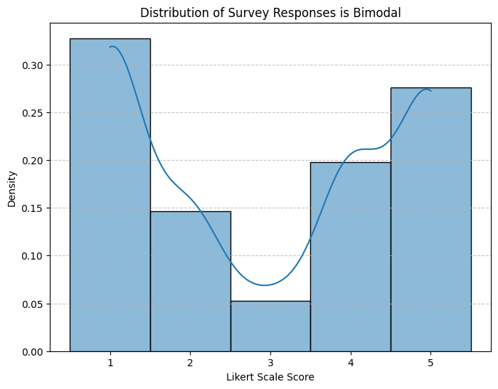
Scenario 1: Bimodal Distribution with Few Responses in the Middle
In some cases, we may see strong patterns in our perception data that makes it clear that people have strong positive or negative perceptions. In these kind of scenarios and if we mostly care about differentiating between positive and negative perceptions, we can simply create a binary outcome to capture positive and negatives. Here is an example distribution for a 5-point Likert scale data that shows a bimodal distribution pattern:
In this example, there are two approaches that you can take in creating the dummy binary outcome:
Approach 1: You mainly care about the top 2 boxes, so create a binary outcome as:
Binary outcome = True if Likert scale response is 4 or 5, otherwise False
Approach 2: You want to focus on positive vs. negative, so create a binary outcome as:
Binary outcome = True if Likert scale response is 4 or 5 and Binary outcome = False if Likert scale response is 1 or 2
This will omit data from the middle (value of 3), so you need to check and ensure that doesn’t impact your overall conclusions, dataset size, or bias your representativeness.
Scenario 2: Focusing on a Specific Type of Perception
In some cases, regardless of the overall distribution of responses, the focus may be on modeling specific types of perceptions. For example, if the goal is to identify the key drivers of extreme satisfaction and use them as guiding principles for strategic decisions or optimizations, it can be useful to simplify the data into a binary outcome.
For instance, we could define the binary outcome as:
Binary outcome = True if Likert scale response = 5
By concentrating on respondents who provided the highest rating, we can better understand what drives exceptional satisfaction and tailor our strategies accordingly.
Scenario 3: Understanding Differences Between Specific Categories
Consider a scenario where a survey measures the likelihood of considering a paid version of a product using a Likert scale from 1 (very unlikely) to 5 (very likely). Suppose the marketing team wants to focus on the "undecided" group and identify the key factors that differentiate them from users with high purchase intent.
For this type of analysis, it may be helpful to create a binary outcome, such as:
Binary outcome = True if Likert scale response ≥ 4 (high consideration), False if response = 3 (undecided)
This approach allows us to isolate and analyze the factors that influence users who are on the fence, providing actionable insights to guide targeted marketing strategies.
Now let’s get to the classification methods.
Classification Methods
Binary classification methods are widely used in Machine Learning and Data Science to categorize data into one of two classes based on input features. Some popular techniques include:
Logistic Regression: Predicts the probability of a class using a simple sigmoid function. Best for linearly separable data and easy to interpret.
Decision Trees: Split data based on feature importance. Flexible and easy to understand, but can overfit without tuning.
Random Forests & Gradient Boosting: Advanced versions of decision trees that combine multiple trees to improve performance and reduce overfitting.
Support Vector Machines (SVMs): Finds a hyperplane that maximizes the margin between classes. Good for complex boundaries, especially in high-dimensional data.
Neural Networks: Powerful models that can capture complex patterns, but require a lot of data and computational resources.
Naive Bayes: Assumes features are independent and is often used for text classification tasks.
When it comes to applying classification methods to survey data, I’ve found that the most practical and user-friendly approach is logistic regression, especially when the data is relatively simple, there aren't too many predictors with collinearity, and the assumption of linearity is reasonable. Logistic regression is highly interpretable and easy to explain, making it my go-to starting point for survey analysis.
Another method worth considering is decision trees. Personally, I’m a big fan of decision trees because they effectively capture interactions between predictors and are highly intuitive. However, they are simple decision trees are also prone to overfitting, and in my experience, I have yet to see a simple decision tree model consistently outperform logistic regression or more advanced ensemble methods like random forests. For this reason, I won't delve into decision trees further but instead focus on random forests and gradient boosting models, which are still tree based models without the limitations of a single tree based model. These methods excel at capturing complex relationships, handling missing data, and managing collinearity. However, they do require a solid understanding to ensure proper usage and interpretability.
Other techniques, such as support vector machines (SVMs), neural networks, and Naive Bayes, can be powerful tools. However, they often lack the interpretability needed for UX research and survey modeling, where understanding the underlying relationships is typically more valuable than achieving the highest predictive accuracy. For this reason, I will not cover them in detail here.
Logistic Regression
Logistic regression is a straightforward and interpretable method for binary classification, making it a great choice for those familiar with linear regression. Its simplicity and ease of interpretation make it particularly useful for survey analysis.
Let’s consider a survey where we asked a representative sample of both users and non-users about their likelihood to consider a paid premium version of our service—a creative editing tool. Our goal is to identify key factors that differentiate those who are likely to consider the paid service (respondents who selected 4 or 5 on a Likert scale) from those who are undecided (respondents who selected 3).
To achieve this, we can leverage a variety of predictor variables, including:
Demographics: Age, gender, income, country, and region.
Attitudes, needs, and perceptions: Current subscriptions, interest in editing tools, use cases for editing, and usage of competitor services.
Current usage and engagement: Level of activity, types of features used, and frequency of engagement with our service.
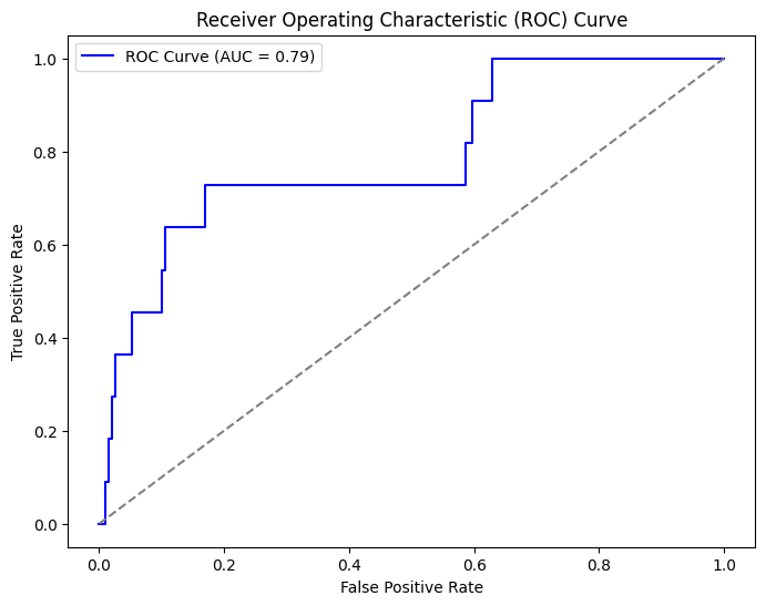
Now, let’s set up a logistic regression model by splitting the data into training and testing sets using stratified sampling to maintain class proportions. We can then train the logistic regression model on the training set and evaluate it on the test set using various performance metrics. For performance metrics, we can include a confusion matrix to assess classification performance, a classification report providing precision, recall, and F1-score, and an ROC curve to evaluate the model's ability to distinguish between the two classes.
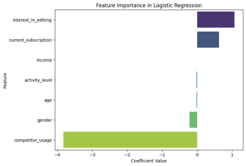
Additionally, we can examine feature importance by analyzing the model's coefficients to understand which factors most influence the likelihood of considering the premium service.
Interpretation of Results:
Feature Importance:
Positive coefficients indicate factors that increase the likelihood of considering the premium service (e.g., "interest_in_editing" and "current_subscription" have high positive coefficients).
Negative coefficients show factors that decrease the likelihood (e.g., "competitor_usage" reduces the likelihood of considering the premium service).
Confusion Matrix & Classification Report:
Provides insights into how well the model distinguishes between those who would consider and those who wouldn't.
Metrics like precision, recall, and F1-score help evaluate the model's performance.
ROC Curve:
The AUC (Area Under the Curve) value indicates the model's ability to distinguish between the two classes.
A higher AUC suggests better discrimination between those likely and unlikely to consider the premium service.
Gradient Boosted Decision Tree (GBDT) Models
The problem with Logistic Regression is that it is very sensitive to collinearity between predictors and in many cases where the models get more complex, it just doesn’t work well. A great alternative are Gradient Boosting Decision Trees (GBDT). They are a powerful ensemble learning method for binary classification, particularly useful when there is complex interaction between predictors or when some level of multicollinearity exists in the data. Unlike logistic regression, GBDT does not rely on assumptions of linearity or independence among features, making it an ideal choice when dealing with collinearity or nonlinear relationships between variables.
In this case, let’s continue with the survey where we asked respondents about their likelihood to consider a paid premium version of a creative editing tool. Given the potential for multicollinearity among the predictors (e.g., “interest_in_editing” and “current_subscription” might be highly correlated), GBDT can provide more robust predictions than logistic regression.
How GBDT Works:
GBDT builds an ensemble of decision trees, where each successive tree attempts to correct the errors made by the previous ones. The algorithm is typically trained in a stage-wise manner, where each tree is built based on the gradient of the loss function with respect to the previous predictions.
The output of the model is a weighted sum of the predictions from all trees, which leads to improved accuracy over a single decision tree. GBDT can handle both continuous and categorical variables, making it very versatile.
Approach to Applying GBDT:
Data Preprocessing: Similar to logistic regression, we would begin by cleaning the data and encoding categorical variables. However, GBDT can handle certain types of missing data and does not require feature scaling (e.g., normalization) like logistic regression.
Training: We would train the GBDT model on the training set, which involves selecting parameters such as the number of trees, the depth of each tree, and the learning rate. Cross-validation can be used to fine-tune hyperparameters and prevent overfitting.
Evaluation: Like logistic regression, we can evaluate the model on the test set using metrics like confusion matrix, classification report (precision, recall, F1-score), and ROC curve. GBDT models tend to perform better in terms of accuracy and model robustness, particularly in the presence of complex, nonlinear relationships.
Pros:
Handles Collinearity: GBDT models naturally handle multicollinearity better than linear models like logistic regression. This is because trees split data on the basis of features that provide the best possible division, rather than assuming independence.
Flexibility: GBDT can capture complex nonlinear relationships, which makes it more versatile than logistic regression in scenarios with intricate data structures.
Out-of-the-Box Performance: Often, GBDT models deliver better performance with minimal tuning compared to simpler models like logistic regression.
Feature Interaction: GBDT models automatically discover feature interactions, providing a more accurate reflection of how multiple factors combine to influence the outcome.
Cons:
Interpretability: While GBDT provides good predictive performance, interpreting the individual contribution of each feature can be challenging. Unlike logistic regression, where the coefficients directly indicate the importance and direction of influence, GBDT requires additional techniques (e.g., SHAP values or feature importance plots) to interpret model decisions.
Computational Complexity: Training a GBDT model can be computationally expensive, especially with large datasets, as the algorithm involves building multiple trees iteratively.
Overfitting: Although GBDT is robust, it can still overfit, especially when the number of trees is too large or the trees are too deep. Regularization techniques (e.g., limiting tree depth, subsampling) are essential to avoid this.
Let’s briefly discuss the interpretation of feature importance in the case of GBDT models.
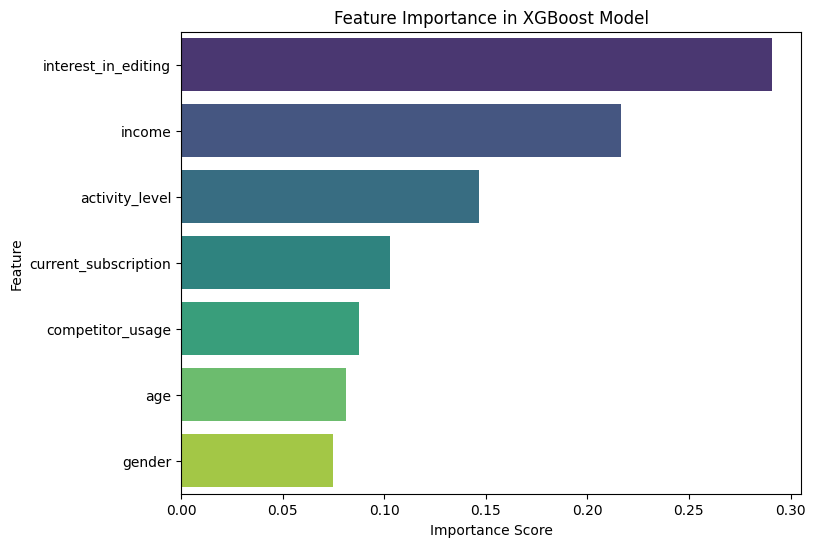
Feature Importance:
Feature importance is computed based on how much each feature contributes to the model’s prediction accuracy. For example, features like “interest_in_editing” or “current_subscription” might be ranked as top features, depending on how predictive they are for classifying users who would consider a premium version, their direction is not clear based on the importance score though.
We can also use techniques like SHAP (Shapley Additive Explanations) to get a more granular understanding of how each feature influences individual predictions, addressing the challenge of interpretability in GBDT.
This plot shows the distribution of SHAP values for all features and instances in the dataset. It’s a good way to visualize overall feature importance and the relationship between features and the output.
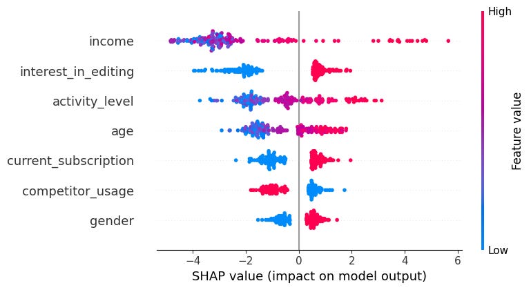
The SHAP summary plot is an essential tool for interpreting the impact of individual features on model predictions. Here's how to interpret the main aspects of the summary plot:
Feature Importance:
Features are listed along the y-axis in the order of their importance. The more important a feature is, the higher it appears on the y-axis.
The horizontal axis represents the magnitude of the SHAP values. These values represent the contribution of each feature to the model's prediction. Larger absolute SHAP values mean that a feature has a more significant impact on the model's prediction.
Distribution of SHAP Values:
Each dot on the plot represents the SHAP value for an individual instance (i.e., a data point) for that particular feature.
Color Coding: The dots are typically color-coded to show the value of the feature for each instance (from low to high). This helps to understand how the feature values influence the model's prediction:
Red: High values of the feature.
Blue: Low values of the feature.
The distribution of dots shows the range of SHAP values for each feature. For example, if most dots for a feature are clustered around zero, it means that feature has a low impact on the model’s predictions for most instances.
Feature Effects:
Positive SHAP Values: Indicate that the feature increases the predicted probability of the positive class (e.g., "premium service" in your case).
Negative SHAP Values: Indicate that the feature decreases the predicted probability of the positive class.
The spread of dots along the horizontal axis shows whether the feature’s influence is consistent across all instances or if it changes significantly depending on the input data.
Interpreting Key Insights from the Plot:
Which Features Are Most Important?
The features at the top of the y-axis are the most influential in terms of model predictions.
For example, the plot above income appears at the top, it means this feature has the highest impact on the likelihood of considering a paid service.
How Does Each Feature Affect the Prediction?
By looking at the SHAP value distribution (the spread of dots), you can tell how each feature affects the prediction.
If a feature has a wide spread (e.g., from blue to red across the axis), it means that its influence can be positive or negative depending on the instance’s value.
If the dots are mostly to the right (positive SHAP values), it means that for most data points, this feature increases the predicted probability of considering the premium service.
If the dots are mostly to the left (negative SHAP values), the feature tends to decrease the predicted probability of considering the premium service.
Are There Any Features with Minimal Impact?
Features with dots clustered near zero (small SHAP values) suggest that these features do not strongly influence the model's predictions. For example, if the gender has the lowest spread and has dots very close to zero, it means this feature is relatively unimportant for the model.
How Do Different Values of Features Influence Predictions?
The color gradient from blue to red indicates how feature values correlate with the SHAP values:
If red dots are to the right (positive SHAP values) and blue dots are to the left (negative SHAP values), it means that higher feature values lead to higher predictions for the target class.
Conversely, if red dots are to the left and blue dots are to the right, it suggests higher feature values decrease the predicted likelihood of the target class.
This plot can be an incredibly useful tool to understand how your model makes decisions, and it can help you to identify features that might need further refinement or explain why the model behaves the way it does. As you can see there is a lot more insights that can be gained from GBDT models than from a logistic regression but there is also more complexity.
Which one you use, really depends on the goals of your research and the questions you are answering.
Very well done!